|
Example one
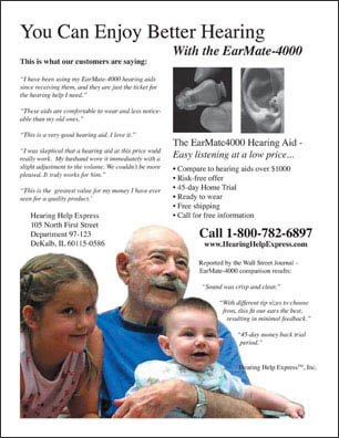
This full page ad (above left) is from the VIA magazine, but it could have been published in any magazine. An ad this size costs about $10,000 to publish! However, this company obviously did not spend a penny on a designer. If this ad were intended to be funny, they succeeded. But I don't think that's what they had in mind. Somehow, they ended up with one of the worst ads I have ever seen in print. They probably have a good product - and the product photos themselves are fine. But the layout and typographical elements are well, let's just say, unprofessional. No internal structure, no organization, too many fonts, boxes scattered all over; it definitely does not look like it was created by a trained graphic designer.
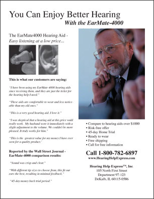
The "makeover" version, on the right above, actually contains exactly the same textual information, but the new layout is "airy" - it does not look crowded. There is plenty of white space, and the text flows down the page comfortably. There is color, the same colors, in fact, but they are located on the photograph, where they should be. It is built on a two-column template, which gives it structure and a sense of organization, but the ragged-right justification gives a looseness and casualness to the ad, lending a sense of ease and comfort to the overall design. It doesn't "yell" like the first ad does.
What it does speak loudly to is the human element of the target market. Marketing is the science of knowing the needs and wants of the target market. The "makeover" design appeals to the inherent human desire to hear and be heard.
Can you think of some other scenarios in which one would want to hear and be heard? Imagine another photo in the ad, perhaps of a quiet moment with an old friend, a telephone conversation, a concert, a lecture, a business meeting, etc. Maybe the headline will change a bit to reflect just how critical is the need to hear. (If you are inclined to be the comic, a political satire could be fun. But, for this one, let's keep it serious!)
What do we mean by a "better" design?
|
 |
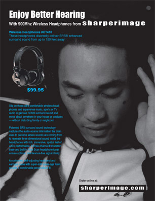
By simply swapping out the photos, keeping the layout and main text elements essentially the same, we arrive at a very different ad, one that is marketing another great product, stereo headphones, to a very different market.
The concept is similar: the desire to hear well, but the product appeals to a younger audience. I wonder whether that target market will take its listening habits into the future? We can only conjecture whether they will need hearing aids even more in the future, or whether headphones will do.
Again, good marketing is knowing the target market, and appealing to their sensibilities. In general, this means the focus is on PEOPLE: the users, the customers, the clients. Notice how important the "user" is in the designs below.
What an evolution from "before" and "after!"
Clipping Path
p.s. remind me to show you how to create a "clipping path" to make the small photo box transparent.
|